“A fresh coat of paint can transform not just a room, but the entire atmosphere of your home.”
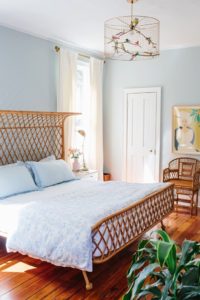
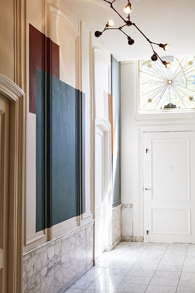
If you’ve noticed the colors on your walls fading or losing their shine, it might be time to do something about it. Faded walls can make any room look dull and uninviting, even if the furniture and decor are in great shape. But don’t worry, the solution is simpler than you think. With expert interior painting, you can bring new life to your space and turn your faded walls into a stunning focal point. Interior painting companies in Kansas City can help you achieve the vibrant, fresh look you’re aiming for.
Walls can fade for many reasons, including exposure to sunlight, frequent cleaning, or simply the passage of time. Colors naturally lose their vibrancy when exposed to elements like sunlight and humidity. Over time, even the best paints will begin to show signs of wear, especially in high-traffic areas like living rooms, kitchens, and hallways. But you don’t need to put up with it. Professional interior painting can bring that fresh, bright look back.
Picking the right type of paint is essential for keeping your walls looking beautiful for longer. Some paints are designed to resist fading and dirt buildup better than others. Choosing high-quality paint and the right finish (matte, satin, or gloss) can make a significant difference. Interior painting companies in Kansas City often recommend a few trusted brands that are known for their durability and long-lasting results.
While it might be tempting to take on the task of repainting yourself, hiring professionals for interior house painting services ensures the job is done right. Professional painters have the skills, equipment, and experience to do a flawless job. They can also help you choose the right colors and finishes that match your home’s design. More importantly, they have the tools to prepare your walls properly, ensuring that the paint adheres well and lasts longer.
Reviving the charm of your faded walls is easier than you think with professional interior house painting services. Over time, wear and tear can take a toll on your walls, but that doesn’t mean you have to settle for dull spaces. Let Decker Service Professionals bring your walls back to life with expert painting. We proudly serve the greater Kansas City area, including Liberty, Kearney, Independence, Lee’s Summit, Gladstone, Blue Springs, Leawood, Prairie Village, and much of Overland Park. Reach out today, and let’s restore your home’s beauty with a fresh coat of paint!
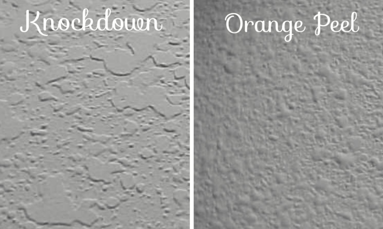
Popcorn Texture Removal
Why Consider Popcorn Texture Removal?
There are several reasons why homeowners consider popcorn texture removals. For one, it can be difficult to clean and maintain. The texture tends to attract dust and cobwebs, making it a breeding ground for allergens. Additionally, popcorn ceiling texture can make a room look dated and unattractive, especially if it has yellowed over time.
Another reason to for popcorn texture removal is that it may contain asbestos. Asbestos was commonly used in popcorn ceiling texture until the late 1970s, when it was discovered to be a health hazard. If your home was built before 1980, it’s a good idea to have the popcorn ceiling tested for asbestos before attempting to remove it.
How to Remove Popcorn Ceiling Texture
Tips for Popcorn Texture Removals
When removing popcorn ceiling texture, it’s important to take the necessary precautions to protect yourself and your home. As mentioned earlier, if your home was built before 1980, you should have the popcorn ceiling tested for asbestos before attempting to remove it. If asbestos is present, it’s best to hire a professional who is trained in asbestos removal.
Even if asbestos is not present, you should still wear a mask and goggles to protect yourself from dust and debris. Use plastic sheeting to cover the floors and furniture in the room to avoid damage and make cleanup easier. Turn off the electricity to the room to avoid any accidents.
It’s also a good idea to work in small sections and mist the ceiling with water before scraping to avoid damaging the drywall underneath. A fan can be used to help dry the ceiling after misting it with water.
In conclusion, popcorn texture removal can be a messy and time-consuming process, but it can also be a rewarding DIY project that updates the look of your home. Just be sure to take the necessary precautions to protect yourself and your home and follow the steps carefully for the best results.
Kansas City, MO: Transitional style refers to a type of Interior Design style where there is a contemporary mix of modern and traditional furniture, accessories, interior paint colors and other decorative features. It dismisses both the ornate features of traditional design and the clean and basic lines of contemporary design, resulting into a classic, seamless and timeless design. To put it simply, it’s the “just right” design. This article discusses the style and outlines some paint colors for transitional style
Why choose Transitional Style?
If you look at magazines and design websites, it’s the most common Interior Design style, proof that it can’t go wrong. It gives homeowners the freedom to merge styles from the past and present without having to lock in on one design era.
The Elements of Transitional Style
The goal of this style is to bring in the warmth of the past while toning down the exuberance of traditional design with cleanliness and the simplicity of contemporary design. Transitional Style can be summarized into three words: simple, clean and serene. This is reflected in its furnishings, interior painting colors and overall decor.
Simple silhouettes are preferred, typically straight lined although a few curves here and there will soften the look. You can use updated furniture from old styles like a modern Baroque armchair or a Wingback chair as your accent chair for the living room.
Paint colors for transitional style include beige, grays, browns, and even some bold accent colors like charcoal. Also, but other neutral tones and warm earth colors can also be used. There are no strict color palettes but monochromatic schemes are preferred to keep the space from looking busy. Bright accent colors are kept to a minimum and are better used in accessories. If prints must be used, use it subtly and avoid loud patterns.
Neutral floors are also a huge player in this style. Emphasis is placed on the color of flooring rather than the material. Wood, stone, carpet or tiles can be used as long as the color is subtle.
While accessories are encouraged, it shouldn’t make a room look crowded at all. Rugs, blankets and throw pillows are bonus accessories that can make a space feel more comfortable. Pick accessories that will create visual impact and fun conversation starters but won’t take away the overall feel of the space.
Rich velvets or other texture heavy fabrics may look odd in a Transitional space, but natural fibers can help make a room pop. Rattan, wool, leather, burlap and more will fit right in.
Opt for crisp, clean drapes with pared-down paint colors. Window pelmets can hide unsightly hardware. Blackout shades paired with crisp linen drapes give an airy feel while still providing shade and privacy.
The key to achieving Transitional style is to create a balance between old and new. It’s easy to go overboard with both styles and the solution is to find a way that makes both traditional and modern work together fluidly.
Another takeaway here is minimalism. Transitional style shies away from clutter and instead embraces the less-is-more approach taking in the clean and simple traits of contemporary design. In order to achieve this style, you must be prepared to part ways with a few of your prized design pieces.
Transitional Style in your Home Room by Room
Living Room
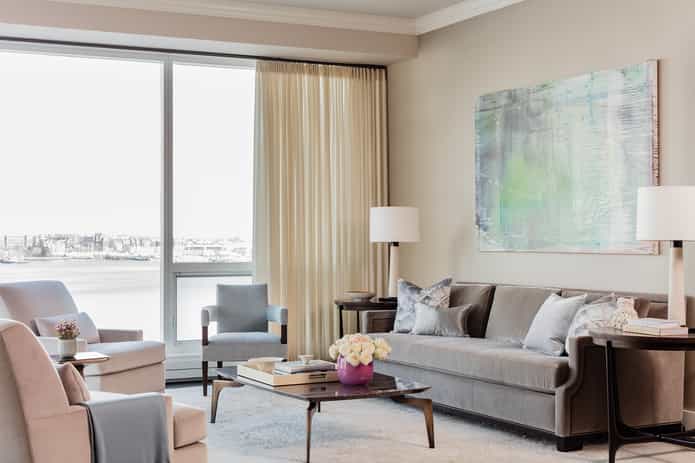 If your area has traditional architectural features such as trims, wall panels and molding, choose simple furniture with clean lines. Keep furnishings in the same scale so that it doesn’t compete with the other. Taupe and cream are wonderful wall colors that will accentuate wood floors and earthy tones. Sticking to one color all throughout the room will make brighter accents pop out.
Paint Colors for Transitional Style for the Living Room Recommendation: Benjamin Moore Gentle Cream OC-96

Bedroom
For bedrooms, you can choose from cool neutral shades ranging from blues to greens to make it more tranquil. Canopy or four-poster beds and beds with 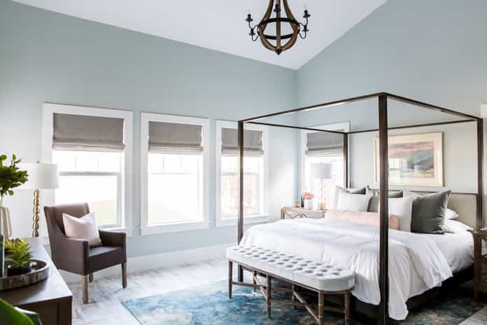 traditional curved headboards both work well for the Transitional style. Give it the modern twist by flanking it with contemporary glass nightstands and classy table lamps. Other furniture you can use are wood drawers and a modern wingback chair paired with an ottoman.
Bedroom Paint Color Recommendation: Benjamin Moore Pale Smoke

Kitchen
For kitchens, the touch of modern is already there with appliances in shiny chrome finishes. Trade in lacquered cabinets with 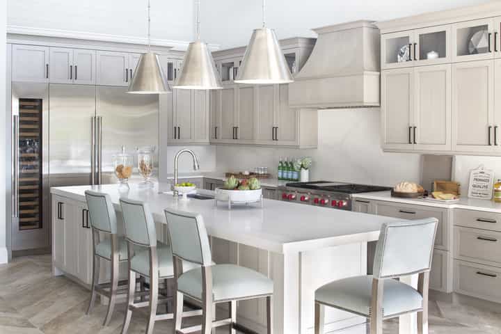 paneled wooden ones and opt for natural finishes like wood flooring and countertop in marble or granite. Since the Kitchen is an area of the house that has the most mixed materials, choose clean, light colors for your walls and let the other natural elements do the work.
Other traditional elements you can add to your kitchen are corbels for floating shelves and crown moldings for your cabinetry.
Paint Colors for Transitional Style Kitchen Recommendation: Sherwin Williams Alabaster

Dining Room
Use luxurious dining chairs upholstered in rich textiles and couple it with a more contemporary glass or wooden dining table. At 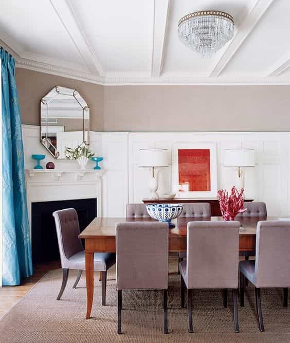 this point, you can even use brightly colored dining chairs as your accent pieces. Wainscoting or paneling is another way to lend a touch of traditional element to an otherwise contemporary space. Complete the space by adding a vintage chandelier.
Dining Room Paint Color Recommendation: Sherwin Williams Queen Anne Lilac

Bathroom
Clawfoot tubs are wonderful vintage pieces that go way back to the 19th century, yet when paired with glass and metal in bathrooms, it manages 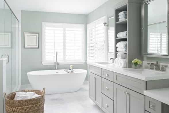
Paint Colors for Transitional Style Bathroom Recommendation: Benjamin Moore White Ice

Transitional design is one of the most versatile Interior Design styles and anyone can achieve it. Most existing homes are already filled with traditional architectural details and homeowners just have to add contemporary touches to achieve the style. It’s a design style for those who love antiques and yet don’t want their homes to look outdated.
If you’re constantly swooning over bergère chairs and cabriole legs but can’t get enough of the cleanliness and elegance of contemporary design, then this Interior Design style for you.
Perhaps the easiest and most popular home DIY is painting a room, and it’s easy to 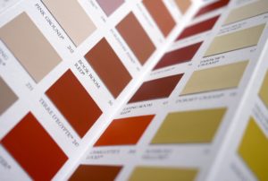 see why. Freshly painted walls are a quick way of giving a room an updated look. As opposed to switching up to more expensive and permanent parts of a room like a sofa or a wall cabinet, it’s easier and more affordable to paint a wall in a color that’s in trend.
Painting is an easy DIY project taking up a day or two of most weekends, and with most paints and primers available in quick-dry formulas, any homeowner can do it. However, there are also interior painting companies who could lend you a helping hand in your painting project. How do you know when you need to employ the services of a painting contractor?
When you just moved in, and you’re looking to paint all the rooms in your house, it might prove to be a huge task, especially if the house needs some repairs along the way.
A lot of homeowners underestimate the amount of preparation needed for walls thinking that it starts and ends with slathering paint on the walls. If there are too many cracks, holes, and repairs to be done on the walls, consider getting the help of a professional painter whose scope of services include surface preparation.
Some contractors specialize in special types of finishes meant for a specific type of material, and if you’re unsure whether you can do it yourself, then you might need some professional help.
Painting may sound easy, but it may take up some of your time as well, and if you are not able to allocate time for painting you will be better off with getting the services of an expert.
Professionals to consider when painting:
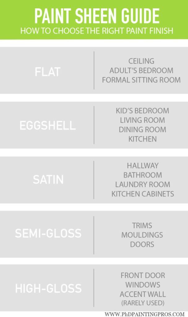
Based on the types of finishes, the glossier the finish, the easier it is to clean. So, painting a room according to its use will help make maintenance simpler for you. 
It’s common for homeowners to underbuy or overbuy paint, but this is avoidable with the right estimation. Most paint manufacturers indicate the estimated square footage a can of paint can cover. Once you know the coverage rate, you need to get  the area of the surface by multiplying the length by the width of the wall or ceiling. Simply add all the sides of the walls to get the total area. You then need to subtract the areas that are not going to be painted like windows and doors.
An example:
You want to paint an accent wall that measures 30 feet in width by 10 feet high with a door that’s 3 feet wide and 7 feet high. Your chosen paint indicates that a gallon can cover 350 square feet. By standard, you’ll be using two coats of paint on the wall so you’ll need to factor that into your calculations as well.
Wall Area = 30 feet (Width) x 10 feet (Height) = 300 square feet
Door Area = 3 feet (Width) x 7 feet (Height) = 21 square feet
Total Wall Area = 300 square feet (Wall Area) – 21 square feet (Door Area) = 279 square feet
279 square feet (Total Wall Area) x 2 (Coat of paint) = 558 square feet
558 square feet (Total Wall Area) ÷ 350 square feet (paint coverage) = 1.59
Round off the result to the nearest whole number to get the required gallons of paint. In this case, you’ll need 2 gallons of paint. If you’re painting all four sides of the room, simply get the wall area of each side and add it together to get the total wall area. Most paint manufacturers also have a paint calculator on their website, but if you’re not confident with your calculations, you can take your measurements to your nearest paint store, and they’ll be happy to do the calculations for you.
Other factors you’ll have to consider is the color of the paint. If you’re using a darker hue, you may need several coats for your desired color to show through. Lighter paints may need to be painted on several times if the existing wall color is darker. Some surfaces are also more absorbent and may require more coats than usual. Higher quality paints are better pigmented and will give you a better-looking paint job.
Choosing interior paint colors can be overwhelming for a lot of homeowners with all the available ideas and inspirations. If you can afford the services of color consultants and designers, they can guide you step-by-step on how to choose colors. Otherwise, you can do it yourself too. Interior Design Magazines and websites have plenty of ideas available, not to mention Pinterest as well as DIY blogs. Here are some tips that will help you to make the right choice:
There are always new colors in style every year, largely thanks to Pantone who releases a trendy new color annually as a guide for designers. However, rather than follow trends, most homeowners want something timeless because they know that trends don’t last forever.
 For living rooms, which is one of the major areas in the house, white remains to be a popular color choice even for those with children. It’s also easy to mix in different finishes with a white background. Other color palettes include gray walls paired with brighter furnishings like yellow or chartreuse, taupe walls with blue and green or blue and orange accents and beige walls paired with more vibrant accents.
Darker and sultry color palettes are saved for bedrooms while cool, calm blues remain popular colors for both Master and Guest Bedrooms. Daring homeowners 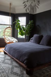 are using black as their wall colors for their rooms as well as dark forest greens and chocolate browns. For those who want a calm and relaxing environment for their room, can still opt for lighter shades of blue.
Contrasting colors prove to be popular, so if you’re going to paint your kitchen walls, look to your cabinets for inspiration. Chartreuse walls add a dash of zest to any kitchen and remains a well-loved kitchen color that compliments white and wooden cabinets. You can also add a splash of yellow using it on spaces between the lower and upper cabinets.
When you have finally chosen your interior paint color, it’s time to settle on the type of wall finishes. Like color, finishes are make-or-break for any room.
Kansas City, MO: While it’s safe to have an all-white or a neutral colored kitchen, not everyone is enthusiastic about light colors. For one, it’s hard 
Since colors aren’t just limited to living rooms and bedrooms, now is the perfect time for risk-takers to explore their creativity with different kitchen wall colors.
The best kitchen paint colors match your personality, creativity, and decor.
Red is a strong and warm color that represents power. Although the color is beautiful, it’s one of the toughest and trickiest colors to use on walls especially in a kitchen where there tend to be mixed materials.
Deep neutral reds like burgundy or maroon work great if you have dark-colored appliances or a black countertop. Brighter reds such as tomato red will make any white or washed out wood cabinets stand out.
Before you slather your whole kitchen wall in red, get several paint samples to test.
Paint Color of the Day: Roycroft Copper Red and Sherwin Williams Positive Red

Green has this youthful and energetic vibe and depending on its undertones, it can make your kitchen look lively or evoke a calm environment that makes you want to 
If you want a burst of color, chartreuse or lime green can liven up an otherwise sterile looking kitchen. These go well with orange or reddish wood cabinets such as cherry or red oak.
Mint green or olive green is refreshing to the eyes and is a safe choice if you just want a hint of color in your kitchen.
One shade of green that is not commonly used as a kitchen wall color is emerald green. This green shade is best paired with white cabinets and marble countertops for a modern retro vibe.

Paint Color of the Day: Sherwin Williams’ Pewter Green and Acacia Haze

Blue is known to be a stress-reducing color and if working in the kitchen can drive you crazy sometimes, this might be the color you need to paint your kitchen in. Blue  is such a versatile color that it’ll go with any material or finish in your kitchen.
Navy blue is a neutral color that may not come to mind at first for a kitchen wall color but it’s a sophisticated shade that makes white and shiny elements stand out.
Cobalt is another tricky shade of blue. It might be hard to pull off but like navy, it creates a beautiful contrast between white and warm toned colors and it’s a very fitting shade that is reminiscent of the Mediterranean style. Using copper or gold hardware with this color will make your space look regal.

Lighter shades of blue like Blue Mist, Aqua or Turquoise will make your kitchen look bright and airy. It is suitable for both white or dark toned elements and can make furnishings in warm colors pop!
Paint Colors of the Day: Benjamin Moore’s Van Deusen Blue and Bird’s Egg

Gone are the days when pink used to be a color that women and little girls identified 
A softer blush can be paired with warmer wood tones and neutrals to help tone down the juvenile feeling. Using modern elements with pale and soft pinks prevent your kitchen from falling back into the outdated 80s look.
.
.
Paint Colors of the Day: Sherwin Williams’ Exuberant Pink and Benjamin Moore’s Pensacola Pink

If you want some bright happy colors in your kitchen, you’ll never go wrong with 
Although these colors can go awry, when used correctly, it adds some tropical zest to you your kitchen. Orange seems tricky to use in traditional kitchen styles making it look outdated but with modern kitchens, it seems to elevate the look.
It goes well with warm wood tones such as cherry wood cabinets. Orange is best used as an accent color before entirely committing your kitchen.
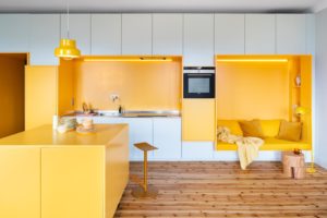
Yellow just like orange takes some getting used to. The good thing about yellow is that it has many shades appropriate for the kitchen. You can choose from mellow pastel yellows, a bright citrusy lemon shade and a mustard yellow that makes a wonderful backdrop for blue and red kitchen accessories.
If you have rustic bricks in your kitchen, yellow is the perfect shade to go with and it also goes so well with oak kitchen cabinets.
Paint Colors of the Day: Sherwin Williams’ Lemon Twist and Benjamin Moore’s Spicy Jeweled Peach

While gray has been a wonderful inclusion in colors for rooms such as living rooms, bedrooms and toilets, it is still an underrated shade as a kitchen wall color. If you have colorful appliances or finer finishes that you want to stand out in your kitchen, gray is the perfect backdrop for that.
It’s a very versatile shade that can be used in both lighter or darker tones without being too overwhelming and it can work for both traditional and modern kitchens.

Paint Colors of the Day: Benjamin Moore’s Wrought Iron and Bunny Gray

There’s this saying, “You can never go wrong with Black.” This holds true when it 
Among all the colors discussed, black has to be the most daring kitchen wall color and for a good reason. Black can suck out light and make a space look cramped and dreary but used the right way, it can make your kitchen look elegant.
If your kitchen has plenty of windows, skylights and has a tall ceiling, these can balance out the black color. What if your kitchen isn’t blessed with windows? Pairing it with neutrals and reflective surfaces and finishing off with good lighting can still make a black kitchen feel light and airy.
Paint Colors of the Day: Benjamin Moore’s BlackBerry and Sherwin Williams Caviar

Kitchens are where you walk into first thing in the morning when you want to make breakfast. Do you want to be greeted with muted, pastel colors or be awakened with a fresh splash of color?
Not every homeowner will take the risk of these options as their kitchen wall color but for those feeling a bit more daring, remember that paint isn’t permanent and can be changed anytime. White kitchens will always have a spot in every homeowner’s hearts but it’s about time bright and colorful kitchens get noticed too.
Kansas City, MO:
Thinking about painting? Looking for interior painting ideas? Redecorating can be hard, and sometimes, choosing the right paint color can feel impossible. With all of the options out there, it can feel overwhelming at times, but did you know that your design style can help you with the colors to use? Below we’ve laid out and explained the most popular decorating styles out there, as well as examples of which colors you could paint your walls. Keep reading to find out what colors suit your design styles!
Classic, regal, and opulent; These two styles exude class and wealth. I like to call this  style “The room that every house has, but no one is allowed to sit in.” So, what’s the difference between these two? Think of transitional decor as the more relaxed and modernized daughter of Traditional. Transitional decor is a mix of traditional and contemporary. It has the same regal feel as traditional, with comfort and simplicity as contemporary. When it comes to these two styles, it’s all about neutral base pieces, such a sofa’s, and bold, classic, prints in the accessories and accent pieces. Furniture pieces are either made of wood or upholstered with fabric.
When it comes to the interior painting ideas for these styles, you can use any neutrals or any colors that appear in your patterned accent pieces! When I think of Traditional/ Transitional decor, I immediately think of warm neutrals; such as cream, and taupe, warm reds, soft yellows and soft blues and vibrant greens. Here are some perfect paint colors for your space.
Color Picks for Traditional / Transitional

Contemporary design is one of the most popular design styles out there today. Often, it is confused with and mislabeled as modern, but contemporary design is a style of its own! It’s known for being sleek, clean, and casual, sprinkled with luxe accents  and fabrics. Metals, glass, wood, and stone is used in accent furniture such as tables. Colors are usually neutral, with little pops of color and pattern; such as throw pillows, blankets, and accessories.
When it comes to interior painting ideas for this style, stick to soft neutrals; such as whites, greys, and taupe. If you feel you need a bit more personality, think about creating an accent wall with your accent pop of color. Here are some great options:
Color Picks for Contemporary Design

When people talk about modern design, they’re referring back to the design style in the early to mid-nineteenth century. Modern design is very minimalistic and 
Wall colors are generally neutral; such as white, grey, and natural tones. If you’re looking for something a little bolder, opt for an accent wall in a rich color or black. Here are some colors that are perfect for your modern room.
Colors for Modern Style Interiors

Midcentury modern refers back to the ’40s, ’50s, and ’60s. It’s known for being  classic, fun, and bold; with pops of colors and wild geometric patterns. In the past few years, midcentury modern has become highly popular and a front runner when it comes to design. Furniture, such as sofas and tables, have the iconic tapered leg, rugs are shaggy, and texture is everywhere. Wood, stone, glass, and metal is used in everything from furniture and walls to fireplaces and lighting fixtures.
When it comes to interior painting ideas for this style, think about using neutrals or an updated version of the classics; mustard, forest greens, and vibrant blues. This is a style that can handle vibrancy and pizazz, so don’t be scared to take the risk with color! Try these:
Midcentury Color Picks

Nature, nature, nature! These styles are all about focusing on natural materials;  wood, stone, plants, and furs. Who’s heard of Joanna Gains? She is the reigning queen of these styles! It’s simple yet refined, cozy but classy. Natural textures are the main focus of this type of decor. Furniture is casual with a hint of tradition.
Using any colors on your walls could easily take away from the beauty of all of the natural materials used. So, when you think about paint colors, think whites, greys, and tans. It’s all about complimenting the natural elements, not fighting them! Here are some examples.
Color Picks for Rustic / Farmhouse

Boho and eclectic rooms are the “wild child” of design. Fun, funky, and worldly,  these rooms have a way of bringing multiple styles and time-periods together and work in harmony. It is a tricky style to pull off well, but if done correctly, can create a warm and welcoming space. Mixed patterns, upholstered furniture, carved wooden pieces, beautiful ornate carpets, and natural elements add to this style.
When it comes to interior painting ideas for this style and because this style is such a mix of everything, walls can be whatever color your heart desires. Many of these rooms will feature a beautiful tapestry or carpet, so look to them for some inspiration. Here are some ideas for your space.
Boho / Eclectic Color Ideas

Industrial style is known for being stripped back and showing its raw elements; such as exposed beams, air ducts, wood and brick walls, and concrete floors. You’re likely  to see functioning elements in these types of spaces wherein others they would be hidden behind walls. Furniture is usually sleek and neutral. Accent pieces, such as tables and other hard surfaces are made from glass, wood, steel, and iron. These elements often come across as being cold, so if you’re looking to warm up your space, chose warm neutrals.
Walls should be neutral, often white, grey, or tan. If you’re looking to spice it up a bit, think about doing an accent wall in deep warm shades. Here are some ideas:
Industrial Color Picks
As you can see, choosing a paint color doesn’t have to be tricky. Let your style dictate the colors for you. And when in doubt, go neutral, let your belongings be the star of the room. Happy painting everyone!
We want you to love your new interior, so, Decker Service Professionals offers a free interior paint color consultation with every interior coating project you order. Call us today!
“If I see everything in grey, and in grey all the colors which I experience and which I would like to reproduce, then why should I use any other color? I’ve tried doing so, for it was never my intention to paint only with grey. But in course of my work I have eliminated one color after another, and what has remained is grey, grey, grey”– Alberto Giacomettii, Swiss artist
If you’ve browsed through Instagram, Pinterest or any other interior design related platforms lately, one color that may have demanded your attention more than all the others is grey. Over the last few years, grey has become a favorite color of many interior designers. And, although grey has been prevalent on the architecture scene, it has now moved to interior design. Clearly, grey is here to stay. Keep reading and uncover the mysteries of this color.

Grey color psychology is a study of hues, as a determinant of human behavior. According to the study, people’s reaction towards the color of a grey stormy sky can be divided into two groups. On one hand, it is perceived as unresponsive, unattached, dull, conventional, monotonous, depressing and inert. It is thought to be reserved, quiet and conservative. On the other hand, it is a symbol of elegance, intellect, modesty, conformism, and maturity. It represents a formal, exquisite and timeless hue, which evokes the feeling of strength and steadiness.

But grey is so much more than just a mixture of black and white. The human eye can distinguish about 500 shades of grey. Charcoal, slate, ashen, mousy, dove, powder gray and pearl are just some. Depending on its undertone, grey can be warm (by adding pinkish, reddish and brownish undertones), or cold (by adding blue undertones, for example). Light grey is identified as relaxing, soothing and enlightening, whereas dark grey is seen as serious, solemn and inflexible. Light grey shades are mainly feminine in nature, while dark grey shades are masculine. The closer grey comes to black, the more dramatic its appeal is. On the contrary, the closer grey gets to silver and white, the more luminous and vivid it becomes.

Another interesting fact about the color grey is that it belongs to a group of neutral colors. In the language of interior designers, neutral basically means without color. Together with white, beige, blue, ivory and brown, this “colorless” color has the potential to tone down stronger and brighter colors, as well as to accentuate softer ones, making it a fantastic background color. Grey is considered to be a color of architecture and commerce. Apple is a great example of a brand that cleverly uses the color grey in its branding. By using the color grey, Apple achieves a clean and neutral aspect that is recognizable to customers.
Whether you are a Scandinavian interior design fan or mid-century modern interior is more appealing to you, or better yet, if you fancy art decor inspired spaces, grey is the color to work with. When decorating or designing an interior space with any neutral, there are two major approaches you may follow. Firstly, add different shades, undertones, materials, and textures of the same hue. Essentially, just keep adding layers of grey and you can’t go wrong.
If this clean, minimalistic and perhaps too neutral of approach is a little bit too much 
Natural or stained wood elements will look amazing in combination with your grey walls, giving life and warmth to your room and creating the feeling of coziness. For more gentle and feminine interiors, try adding pinks/blush, or celestial colors. Any 
Grey interior paint is a basic yet versatile color, full of meaning and possibilities to play with. If you are opting to paint your interior with this clean, modern, calming, bold but elegant interior, start decorating with this amazing color – grey.
We want you to love your new interior, so, Decker Service Professionals offers a free interior paint color consultation with every interior coating project you order.
Kansas City, MO: You’ve probably read and seen it in every design magazine and your mother must have passed on the rule of staying neutral when it comes to choosing paint colors for your home. But you love teal, orange, red, and even neon green, so what’s stopping you?
There’s a good reason why almost everyone recommends a neutral color for painting living rooms, kitchens, dining rooms, and other rooms in your home – it’s the safest color. It’s easy on the eyes and there’s no way you can go wrong with it. Homeowners don’t like taking risks in their homes but if you really want to have something unique and a home that you can truly call your own, you need to step out of your comfort zone and just say no to neutral colors
One of the biggest hindrances to taking risks with colors is social influence. Opinions of others are always considered when making choices. Staying safe and simple is considered tasteful while going the opposite way is considered being overboard. This is what society dictates and can be seen in magazines and websites. After all, no homeowner would want their guests to criticize their homes.
Neutral colors are the easiest to live with, not only because it’s the safest and easiest to match but because it’s timeless and can keep up with ever-changing trends in design. There’s always a new trendy color every year that comes and goes but neutrals are perennial. For furniture like sofas, armchairs, and tables that tend to be a permanent part of the home for a long time, it makes sense for people to choose neutral colors.
]
The best way to start taking risks with colors is by experimenting with paint. By choosing to paint your walls, you take away the stress of having to choose bolder color options for your furniture. Paint is easier to change than buying new furniture because that sofa in a lovely shade of emerald green didn’t live up to your expectations.
To boost your confidence, start small on an area that you don’t often use like the pantry or a small powder room. Even the insides of a bookshelf or your closet can use a splash of color. This could be the starting point for fearless approaches on bigger areas – like larger accent walls for your living room, bathroom, bedroom, ect.

If you’re not confident enough to bring color into your house, take it outside and go paint that door a bright shade of hot pink. It makes a good first impression and excites guests into thinking about what could be inside your house. Homeowners tend to think of selling their houses in the future so they avoid doing something drastic to their houses. While this is a smart step to take, it’s also wise to live for yourself and not worry about someone you don’t even know who will one day buy your house. A small exterior paint job won’t decrease the value of your house. On the contrary, that house with the big hot pink door might be the talk of the town and might attract potential buyers.
Accent walls are another option to stay on the safer side that lets you see results before deciding to paint the whole room in one color. This is one way to highlight something that you want to show off like a gallery wall. The same rule can be applied to narrow hallways. If you have wall panels, take this chance to break the monotony by adding color on the upper part of the wall. Wary of painting your walls? Splash your ceiling with color. You’ve probably been taught to leave your ceilings white but adding color to it, especially a bright one, can create visual interest and even create the illusion of a higher or lower ceiling.
Color blocking is a painting trend that has transferred from the runway into interior design. To put it simply, it’s the pairing of contrasting colors without a pattern. It’s a great way to add color and quirk to a living space without overwhelming its user.
If you’re still afraid of taking the risk but really want that lime green on your walls, ask your paint shop to tone it down by adding a shade of gray to keep it on the neutral side.
Dorothy Draper, a famous Interior Decorator of the 1920s up till the 1950s, was very anti-minimalist. Her works were always dramatic using huge botanical and floral patterns and contrasting colors often mixed with black. To quote her, “But whatever the reason, brown, grays, and neutrals were the only shades considered ‘safe.’ Now we know that lovely, clear colors have a vital effect on our mental happiness. Modern doctors and psychiatrists are convinced of this!”
Take a page from Dorothy Draper’s book and take a risk with color. If it’s frowned upon by others but makes you really happy, go for it. Can color go wrong? Absolutely. But color can’t be wrong; it only becomes distasteful when it’s wrongly used
Liberty, MO: Interior house painting is one of the best and most affordable ways to brighten up your home or office. Quality interior painting can transform a faded and uninspiring space into an inspiration for you, your guests, or your clients.
The secret to assuring a quality interior painting job (or any painting project) is proper preparation. If adequate painting preparation is not done, there is a high chance that your finished project won’t turn out as flawless as it should.
Preparing your surfaces for interior house painting involves various steps. Therefore, it’s alway good 
If you intend painting the interior of your home or business as a DIY project, then keep these four (4) major steps in mind. They can help you follow a professional process. Here is the process that we follow:
This may sound simple, but read on.
Firstly, it only makes sense that you cover the furniture and floor in the room you’re working on. Skipping this step can spell damage for your furniture and even the floors. Imagine discovering some drops of paint on your sofa or carpet later on after they have dried and set in. We’re sure that’s not something you would want. We recommend taking the time to place all furniture at the center of the room, and cover. Also, consider removing them from the room entirely. This is a important step unless you’re planning on working in an empty room. You can cover the furniture with common materials. E.g. painter’s plastic. Use plastic film, drop cloths, or tarps to cover the floor or carpeting.
Sometimes, paint might drip past your defenses and land on a piece of your furniture or even the carpet or floor. When this happens, you should immediately clean it up while it’s still wet. See below for how to do this.
Even when you are painting a ceiling, we still advise that you cover the entire floor and your furniture. We use drop cloths and canvas to protect the floor from paint. Doing this not only protects your floor, but also provide a platform to lay out all your work tools, supplies, and paint buckets in case of a spill or a dropped brush or roller. Completing this first step, you’ll be able to work faster and make fewer mistakes along the way.
Fill Holes & Cracks, and Seal Stains
Preparing the surface determines how good your final painting project will look. It involves scraping any loose, cracked, or bubbling paint. Patch small holes, cracks and dents with a lightweight joint compound and use tape if necessary. Don’t try to fill them all at once, work in thin layers until the joint compound is slightly above the surface of the wall. Wait for the joint compound to dry, then sand the surface imperfections smooth with the surface of the wall. A sanding sponge is perfect for this. Make sure to caulk around windows and trim if they need it.
Pro Tip – Use a joint compound that dries fast in order to add thin layers in a timely fashion as you work from one patch to another. This will save time.
Prime Repairs]
Always use a primer when you’re painting over unpainted drywall, sheet rock repairs, patches, freshly dried joint compound, and/or dark colored paint. It is also recommended to sand and/or prime any time you paint over a gloss or semi-gloss surface.
Priming serves three significant purposes. Firstly, it helps to ensure that stains don’t bleed through. Secondly, it helps to ensure that you only need to use one coat of paint for the final coating (as long as you select a high quality paint). Lastly, it greatly improves the adhesion of the paint to the surface, which then, reduces future blistering. Keep in mind that professionals typically tint the primer towards the finished color.
High-Quality Paints
Selecting a quality paint can sometimes be a challenge. Typically, the cheaper paints 
A better-quality paint will typically contain less solvents. Solvents are what carries the pigments in a liquid form. In latex paint, the solvent is mainly water and in oil-based paint, solvents are mainly mineral spirits. Solvents can make the paint look and feel thick, but the solvents will evaporate and leave a thinner film of solids and resins.
Painting

Sagging paint typically caused by applying to heavy of a coat or thinning the paint too much.[/caption]
In the process of painting, drips or sags may occur on the wall surface. So, it’s wise to have a moist rag or a cloth nearby that can enable you wipe them up immediately. If the paint you’re using is latex, then make sure you always have a rag and some water at hand. Warm water is preferable as it helps the spills soak up quickly and more effectively.
On the other hand, use mineral spirits when working with oil-based paints. Mineral spirits are usually recommended by the manufacturer for cleanup. In an event when you’re not sure on how to tackle the spills or drips, contact your local painting contractorfor guidance.
We recommend that you also perform some routine checks while painting. These routine checks help to ensure you create a flawlessly painted surface. Firstly, you should check for paint splashes on adjacent surfaces like trim, doors, and base boards. Clean all paint splashes as soon as possible. Also, please ensure there is no paint residue on your shoes as well. You wouldn’t want to be spreading paint around the house, right?
Touch-up Walls and Trim To Create A Perfect Finish
Some people tend to skip this step, but its importance can’t be overemphasized for the final appearance. After 
If you used a roller to paint initially, we advise you use the same so that you can get the exact texture. However, if the affected area is too small for a roller, a little brush would do the job. Touching-up a wall will assure that your final job looks excellent and crisp. Tutorials on touch-up can be found on the internet. Local painting contractors can also be of help.
Pro Tip Spend the extra money on Frog tape. It doesn’t allow the paint to bleed through when taping trim for a straight paint line.
Conclusion
Many homeowners have the most fun during the painting project when choosing their paint colors. This is an important decision and there are many online resources for this. However, irrespective of the color of paint you choose, we recommend you select interior paints which do not produce harmful side effects. Many paints contain Volatile Organic Compounds (VOC’s). Individuals exposed to high levels of (VOC’s) for long periods have reported health issues. It is also harmful to babies as their rate of oxygen inhaled is higher than adults. There are numerous low-VOC or low-odor paints to select from. And they can be tinted in any color you can imagine.
Interior painting is a job that can be completed perfectly. The preparation and paint process as outlined above should not be taken lightly because it is a very crucial to the outcome of the final product. Even the most beautiful colors won’t look as good without proper preparation.
To get the best interior painting services in Kansas City, you can contact us, and we’ll provide you with a free estimate for the rooms you need painted. At Decker Service Professionals, we have the experience to deliver an affordable and high-quality painting service to meet your expectations. We can assure that your interior will look beautiful. If you can imagine it, we can make it a reality.