
Kansas City, MO: You’ve probably read and seen it in every design magazine and your mother must have passed on the rule of staying neutral when it comes to choosing paint colors for your home. But you love teal, orange, red, and even neon green, so what’s stopping you?
There’s a good reason why almost everyone recommends a neutral color for painting living rooms, kitchens, dining rooms, and other rooms in your home – it’s the safest color. It’s easy on the eyes and there’s no way you can go wrong with it. Homeowners don’t like taking risks in their homes but if you really want to have something unique and a home that you can truly call your own, you need to step out of your comfort zone and just say no to neutral colors
The Influence of Others
One of the biggest hindrances to taking risks with colors is social influence. Opinions of others are always considered when making choices. Staying safe and simple is considered tasteful while going the opposite way is considered being overboard. This is what society dictates and can be seen in magazines and websites. After all, no homeowner would want their guests to criticize their homes.
Why People Prefer Neutral Color
Neutral colors are the easiest to live with, not only because it’s the safest and easiest to match but because it’s timeless and can keep up with ever-changing trends in design. There’s always a new trendy color every year that comes and goes but neutrals are perennial. For furniture like sofas, armchairs, and tables that tend to be a permanent part of the home for a long time, it makes sense for people to choose neutral colors.
Using Bold Colors
]
The best way to start taking risks with colors is by experimenting with paint. By choosing to paint your walls, you take away the stress of having to choose bolder color options for your furniture. Paint is easier to change than buying new furniture because that sofa in a lovely shade of emerald green didn’t live up to your expectations.
To boost your confidence, start small on an area that you don’t often use like the pantry or a small powder room. Even the insides of a bookshelf or your closet can use a splash of color. This could be the starting point for fearless approaches on bigger areas – like larger accent walls for your living room, bathroom, bedroom, ect.
Bold Exterior Color

If you’re not confident enough to bring color into your house, take it outside and go paint that door a bright shade of hot pink. It makes a good first impression and excites guests into thinking about what could be inside your house. Homeowners tend to think of selling their houses in the future so they avoid doing something drastic to their houses. While this is a smart step to take, it’s also wise to live for yourself and not worry about someone you don’t even know who will one day buy your house. A small exterior paint job won’t decrease the value of your house. On the contrary, that house with the big hot pink door might be the talk of the town and might attract potential buyers.
Accent Walls
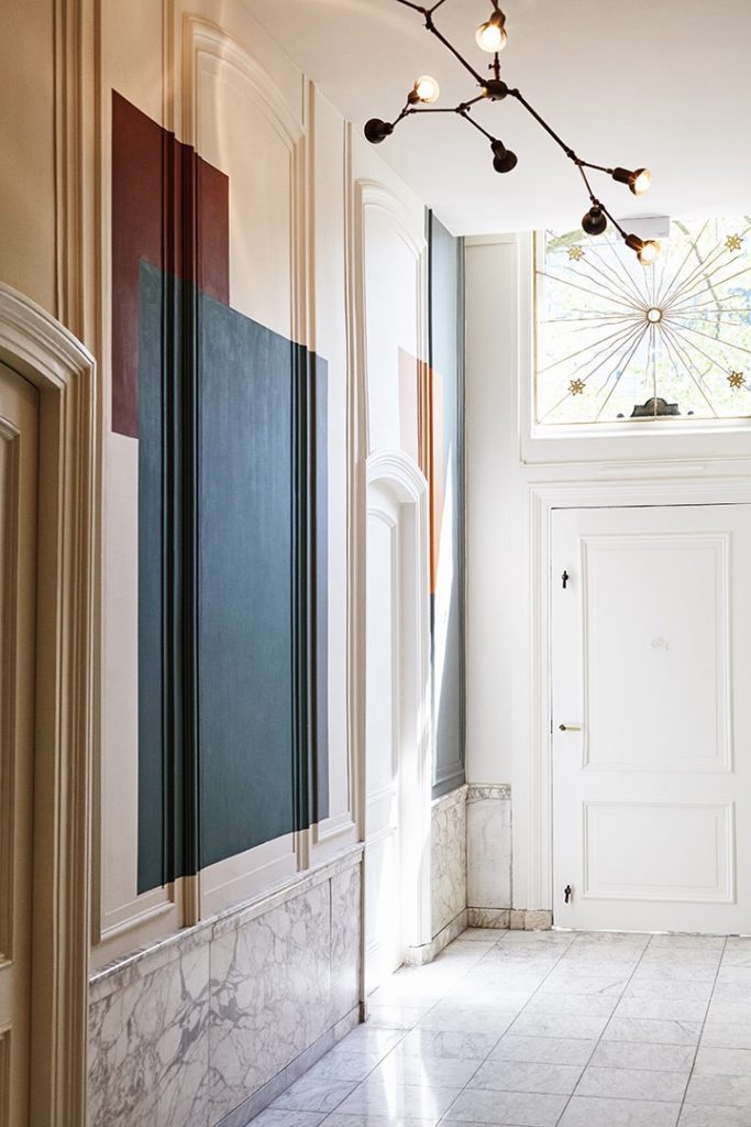
Accent walls are another option to stay on the safer side that lets you see results before deciding to paint the whole room in one color. This is one way to highlight something that you want to show off like a gallery wall. The same rule can be applied to narrow hallways. If you have wall panels, take this chance to break the monotony by adding color on the upper part of the wall. Wary of painting your walls? Splash your ceiling with color. You’ve probably been taught to leave your ceilings white but adding color to it, especially a bright one, can create visual interest and even create the illusion of a higher or lower ceiling.
Paint Color Blocking
Color blocking is a painting trend that has transferred from the runway into interior design. To put it simply, it’s the pairing of contrasting colors without a pattern. It’s a great way to add color and quirk to a living space without overwhelming its user.
If you’re still afraid of taking the risk but really want that lime green on your walls, ask your paint shop to tone it down by adding a shade of gray to keep it on the neutral side.
Dorthy Draper Interior Design
Dorothy Draper, a famous Interior Decorator of the 1920s up till the 1950s, was very anti-minimalist. Her works were always dramatic using huge botanical and floral patterns and contrasting colors often mixed with black. To quote her, “But whatever the reason, brown, grays, and neutrals were the only shades considered ‘safe.’ Now we know that lovely, clear colors have a vital effect on our mental happiness. Modern doctors and psychiatrists are convinced of this!”
Take a page from Dorothy Draper’s book and take a risk with color. If it’s frowned upon by others but makes you really happy, go for it. Can color go wrong? Absolutely. But color can’t be wrong; it only becomes distasteful when it’s wrongly used